
<div class = "row">
In this unit, you will be introduced to a Responsive Web Design Framework called Bootstrap. It uses a Grid System to help us manage the layout of our webpage content.
We will learn how to divide up our webpage into rows and columns.
We will also see that our webpages will automatically adjust their layout depending on the size of the device.
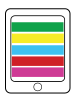


Note that the bigger device's layout has 2 rows. The first row has two columns. The second row has 3 columns.
- xs
- sm
- md
- lg
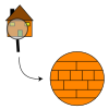
To help us consider Bootstrap's Responsive Web Design Grid System, let's imagine that the screen of our device is like the wall of a house.
We can play with the design of the rows of bricks. This will make our wall, or web page, more interesting to look at.
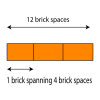
Bootstrap allows us to create rows. Each row has 12 columns for us to work with. Look at the example below for a small device. We create a row and inside the row there are 3 columns, each spanning 4 of the 12 columns available:
<body>
<!-- start of row -->
<div class = "row">
<div class = "col-sm-4">
</div>
<div class = "col-sm-4">
</div>
<div class = "col-sm-4">
</div>
</div>
<!-- end of row -->
</body>
The following video will introduce a practical example of how to develop a Bootstrapped responsive web page:
Challenge 40
Use the images below to create this webpage. Note that it has 3 rows and each row has its own column design:
Follow these instructions and let's put some rows and columns into our web page structure!
- Create a folder called OrkneyResponsive on your computer.
- Click this link to download a zipped folder.
- Extract the contents of the zipped folder into your OrkneyResponsive folder.
- Open Orkney.html in a text editor. It has some content that we will transfer to a new, responsive design.
- Create a new file called OrkneyResponsive.html. Create the HTML, HEAD, STYLE and BODY sections.
- In the HEAD section, copy a link to Bootstrap's css file. You can get this from W3 Schools or Bootstrap's website.
- In the BODY section, create the following row/column structure. Design for small devices.
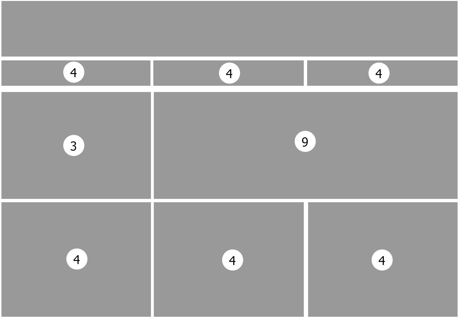
- Next, copy and paste content from Orkney.html to create this design:
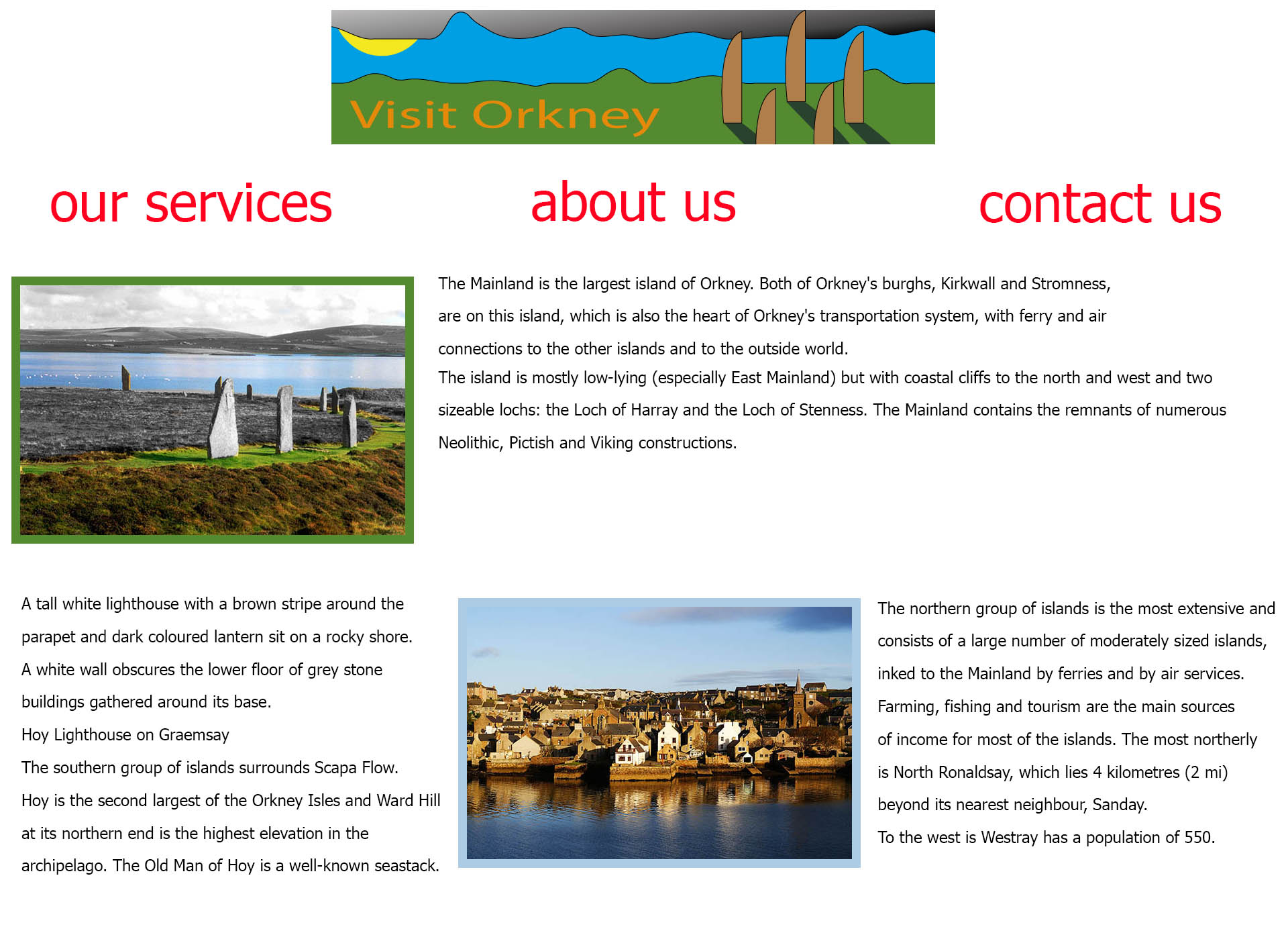
- Resize your browser window to simulate a small device. If you simulate an extra-small device, all of your columns should collapse into one column.
- give any images an img-fluid class if you are using Bootstrap 4.0 or a img-responsive class if you are using Bootstrap 3.0
- Style the 3 menu items to be red, font-size 36 and font-family Courier New.
- Style the two images to have borders as shown.
Upload your OrkneyResponsivefolder to your shared online folder.